PowerPoint
Deadly sins? Yes, you read that right! When people talk about mistakes in Munich, the capital of Catholic Bavaria, then please do so in XXL: we're not talking about minor slip-ups, but mortal sins! And they lurk everywhere when it comes to PowerPoint slides that are shown during a presentation.
01 | Two worlds with different rules
PowerPoint seems to be omnipresent, but you can find it in two main areas of application.
02 | The layout tool for all cases
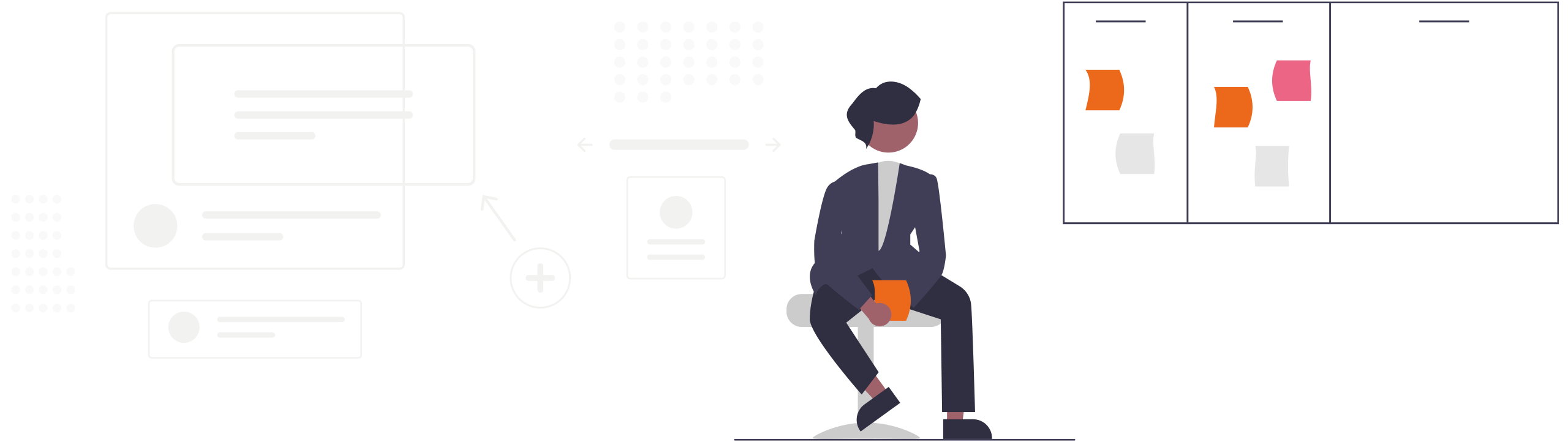
You know the drill: masters, slide layouts, design specifications. Text in, pictures on it, diagrams added.
The PDF for self-study, which you send to the recipients, is ready. The classic layout rules apply here. And if that's not your strong point: give i-pointing a call!
We turn solid content into visual highlights.
03 | The natural habitat: Lectures
This is where it gets exciting. The slides in a presentation are not meant to be read, but to be looked at. The speaker tells a story, builds a story, creates connections. And what may NEVER happen? That the slides distract from the speaker.
04 | A mortal sin: Handouts as slides
Handouts are for reading. Presentation slides for viewing. Point.
Because: If you read, you don't listen. Good handouts are bad presentation slides - and vice versa.
This realization has a massive impact on content and design.
And that's exactly what our series is about:
The 10 deadly sins when creating slides to accompany a presentation.
Stay tuned!
In the next few posts, we'll take apart the worst sins. Or do you want the whole package?
Book a training course with i-pointing.
Online or on site.
info@i-pointing.de
+49 89 30 90 448 0