How to stand out: the PowerPoint application
The classic application is often still a standard cover letter/motivational letter, resume, references and possibly your portfolio. Especially in creative professions, it would be great if you could present your skills and stand out with your application. So how about using PowerPoint to create your application next time?
Below we give you a few tips on how you can stand out from other applicants!
PS: We are currently looking for graphic designers! After you have read this article, please feel free to send your application to https://i-pointing.com/de/karriere/ upload. We are looking forward to you!
This is why PowerPoint is a great tool for applications
If you research the Internet for tips on applications, you will find countless ways to improve your documents – but most often only talk about the classic format. A standard application is also nothing bad! It's just that it's not really special either, and especially in the world of designers and graphic artists, you can really score points with a creative self-presentation. Your potential employer immediately gets an impression of your creative power.
One thing is clear: anyone who opts for a different form of application has made an effort to stand out. This can be a plus point. The significance of PowerPoint presentations is often underestimated, yet it is an important pillar of everyday life in so many companies - why not in an application?
The presentation program enables great presentations of one's own career, strengths and interests.
It is important to note that the focus of a PowerPoint application is primarily on the design options.
The formal framework for a cover sheet or the tabular resume should of course still be observed! In addition, the application documents must always be complete, otherwise you will be immediately sorted out. Therefore, it is better to double-check whether all required documents are included in the application.
Create PowerPoint application: From cover page to typography
The cover sheet
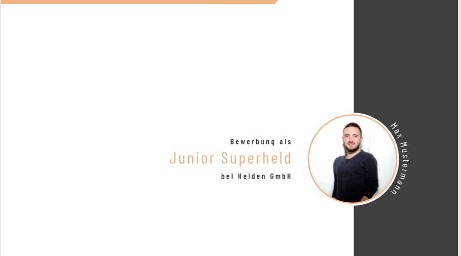
While the cover page is optional for classic applications, the design of a title slide is an obvious choice for an application with PowerPoint and should definitely be focused on.
Basically, your personal data should be on the title slide: Name, date of birth, address, telephone number and e-mail address. Since visuals are particularly important in this application, it makes sense to include a professional application photo.
Don't forget to write the title of the job you are applying for on the cover page.

The cover letter
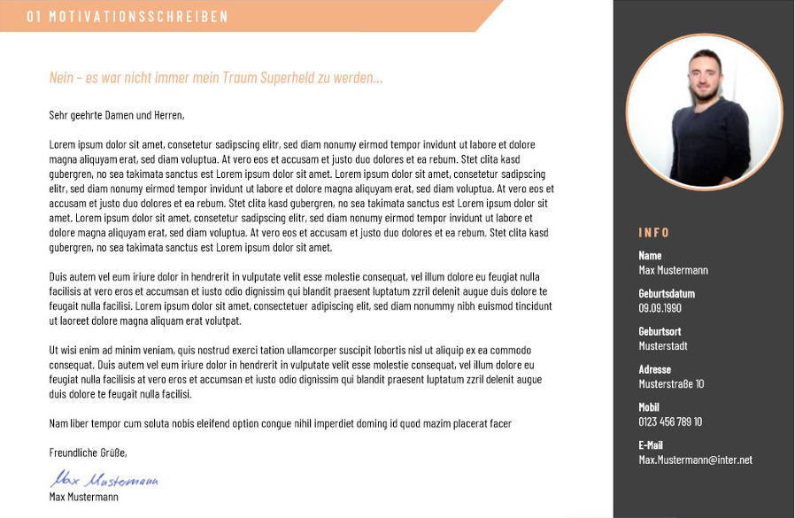
The cover sheet is followed by the cover letter or letter of motivation. Depending on the company's requirements, you should not go into too much detail at this point. Clearly and concisely state why you want this position and why you should be considered for the position.
The curse and blessing of a PowerPoint application is that you can't write your head off.
The format does not allow for filler words or empty phrases. Use the space to clearly show off your skills!

The resume
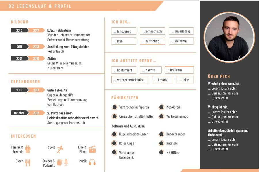
The curriculum vitae should include all relevant information such as school education and professional career. There is also room for personal interests. The trick is to present the tabular resume in a visually appealing way. Since the resume should not extend over several slides, one of the central challenges is to identify the essential aspects and prepare them graphically.
For example, competencies in languages or software can be represented as bar charts instead of resorting to phrases such as "business fluent" or "fluent in spoken and written language". Interests can be visualized in the form of icons or pictograms. In our example, the applicant has used other consistent design features. For example, personal information such as areas of expertise or special skills are listed in the right margin along with an individual application photo.
With all the information, it is important to set the scene and not overload the slides. That's why we worked with three subtle colors in this example. Colors can also be used very well to categorize into different areas like resume or work samples. However, there should not be more than three in total.

The portfolio
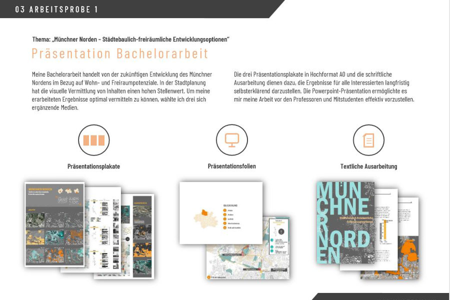
Especially in the creative industry, it is a good idea to include work samples of your own projects, sketches, etc. in the application. However, these are often requested or required anyway. With a small but fine selection, you can show your experience or talents here and thus also go into more detail about your personal successes.

Typography and the right format
Even though PowerPoint offers numerous design options, the motto "less is more" also applies here. Therefore, it is advisable to use a simple and, above all, legible font and to use only this one font in the entire PowerPoint.
For the font size, you should choose a number between 11 and 14 to ensure easy reading.
Small tip: Use dark font on a light background. Recruiters often print out applications and don't want to use so much toner for this 😉
And how do I export my application now, for example, in order to post it on
Upload https://i-pointing.com/de/karriere/ to be able to?
Since the formatting is not always adopted in different PowerPoint versions, you should always send an application as a PDF. Instead of emailing, presentations can also be uploaded to Slideshare and shared via social networks such as Xing or LinkedIn.
MUCH SUCCESS!


