What makes a design "bad"? What characteristics does it possess when the viewer or consumer thinks that the design does not appeal to them at all? How can we learn to recognize these triggers and thus avoid them ourselves?
Recognizing disruptive factors in a design helps on the way to creating good designs yourself! Here's what to look for if a design doesn't appeal to you at all:
1. No structure recognizable
Creating designs goes hand in hand with the art of „Less is more“. Of course, there are always exceptions or artists:inside who deliberately disregard this rule, but basically: if you do not find yourself in a design, it is usually overloaded. Especially not having enough white space makes a design look choppy and unstructured. This effect is transferred to the person who is looking at it. A design should be coherent, so that all information has its place and it is easy to find your way around.
Having trouble finding your way around a design? Another factor could be the lack of typographic hierarchy!
Font sizes and styles guide us through the design, directing our attention to the important points and thus structuring our perception of the design. If that falls away, we are overwhelmed. Headings and subheadings give us orientation and support. For as little unrest as possible, mostly two different fonts The use of different styles, weights, and sizes makes the various elements distinguishable to the eye. White spaces are created in texts with the help of paragraphs and sufficient line heights.
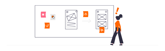
2. inappropriate (graphic) elements
Images, symbols, icons, etc. are used to underline words or to do without them altogether.
It is essential that these also fit the corresponding content and are easy to understand.
You have certainly seen a poster, a sign, etc. and wondered what one of the symbols on it is supposed to tell you. Unfortunately, this is a clear sign of an inappropriate element and marks an unsuccessful design. Use symbols that the majority of the viewers already know, makes much more sense than getting lost in a design that no one understands.
Images should also be used carefully and deliberately to avoid misunderstandings or ambiguity. They should support the idea or concept and not lead to confusion. Be sure to use images, that really represent what they are supposed to and are not a compromise just to have an illustration!
3. non-compliance with the design principles
Sufficient contrast and correct alignment are among the design principles that should be followed for good design.
If a design lacks the necessary contrast, it looks visually unattractive and blurs before the eyes, since clear contours and thus boundaries are missing. This makes the design more difficult to access. In your own design, be sure to create enough contrast between the most important elements (including text and text boxes). Contrasts are also important so that people can focus on the highlighted parts of the design and process it better and thus also understand it.
When looking at a design, you feel like something is bothering you, but you just can't pinpoint what it is? Then you should pay close attention to the alignment, i.e. the arrangement, of the individual elements. If these exist without a reference to each other, we have the feeling that the components have no fixed place. The design looks chaotic. Use a grid to place elements correctly. The baseline grid also helps to ensure that the alignment is correct and that your design looks „tidy“.
You want to learn more about design principles, with which you can take your designs to the next level? Then click here!