:quality(80):format(webp))
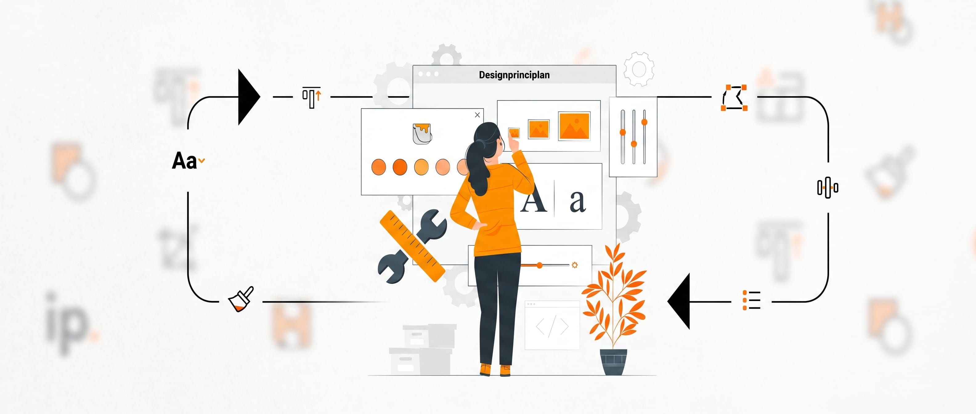
In order to be able to develop and create designs, a basic knowledge of this topic is a great advantage. Design principles provide designers with guidelines to create visually appealing compositions. Often you simply don't have the time to spend hours searching the internet or reading various books. Do you feel the same way? Then you should definitely read on now! There are different opinions about how many design principles actually exist. That's why we grabbed the principles and summarized them ourselves for a quick and organized overview.
1. Alignment
A design is made up of many small elements that ultimately form an overall composition. In order for this composition to look coherent and coherent and uniform to the viewer,the individual elements must be precisely aligned.
The arrangement of texts and graphic elements can refer to thealignment with one another or in relation to the overall design. If the components are found on the design without reference to one another, there is unrest in the viewer's head and a feeling of confusion because no connections can be recognized.
It is all the more important that the alignment of a design is not just done in one place, but that it corresponds to the overall composition.
2. Hierarchy
Through structures we can orient ourselves better - this also applies to designs that have a clear hierarchy. This allowsinformation to be consciously highlighted. The important thing is to emphasize the right things through the design and not accidentally draw focus to the wrong element.Give viewers clues that help them understand what they should pay attention to first, second, etc. A hierarchy can be created, for example, through colors, font sizes or types, or a scale (the relative size of the elements).
Note:Hierarchy is used to make the most important element of your design stand out!
3. Proportions
Here we go into the topic of “scale” in more detail. It is the relative size of the individual elements within a design.
We perceive larger objects as important, while smaller elements fade into the background.Use this effect to arouse the visual interest of your viewersand consciously draw their eyes to certain parts of your design.
Also consider the effect of the size of the elements in relation to each other: if it is too far apart, elements will appear out of place and confuse those who view them.
4. Balance
Maintaining balance is not always easy, but it is very important. The same goes for designs! A balance between the elements is necessary in order to give the viewer a feeling of harmony and coherence.
This can be achieved, for example,through the symmetrical balance. This is achieved when the objects on both sides of an element are equal on a central, vertical axis. So two blocks of text would create a symmetrical balance even if they do not contain the same text.
Further balance can be createdby the asymmetrical axiswhere the elements on either side of the central axis are not identical. A large image and a block of text next to it also create balance. If the vertical axis is not in the center, the element in the narrower area should be given more visual weight so that the overall composition is balanced and appears as a whole.
5. Contrast
The properties of the design elements can be used to create contrasts. Typically, the stylistic device “color” comes to mind first. But there are many other ways to create contrasts in a design, such as through shapes, structures, sizes or even patterns. In particular, the proportions between the individual elements can have a major effect on the overall composition.
Contrasts have two important functions.On the one hand, it makes it possible to differentiate objects from one anotherand thus create a design that does not blur into one another. A design whose elements can be perceived individually was automatically provided with contrast.
On the other hand, contrasts create accessibility.Contrasts have, among other things, have an enormous influence on the readability of texts and can therefore determine the accessibility of a design.
Tip:There are tools that you can use to check the accessibility of your design.
6. White space
White space, also called negative space, serves asfree space without elements within a design. It is the space that the other elements need in order to develop their effect. White space should be consciously incorporated and used in designs! It gives the objects room to breathe and makes a design appear clearer.
Therefore, make sure to leavespace around your elements.In particular, you can use it to highlight your most important object!
7. Repetitions/Consistency
Using the same patterns/fonts/colors etc. makes a design appear harmonious. You can play with specific repetitions togive your design a special mood. In this way, you create a feeling of harmony and continuity in the viewer.
Through uniformity, you navigate the viewer through your design and direct their visual attention. This makes the design look tidy!
Pro tip:To give designs a special twist and to ditch the “classic” design, variety helps. Consciously doing things differently than you would otherwise can work wonders. These special elements break up the design and make it appear completely different, which can also completely change the viewer's attention. Try it out!
We hope we were able to give you some insight into the basics of design principles. Now it's up to you to apply them - and the best way to do that is to practice and try things out! GOOD SUCCESS!!
Source:https://dribbble.com/resources/principles-of-design

:quality(80):format(webp))
:quality(80):format(webp))
:quality(80):format(webp))
:quality(80):format(webp))